I started writing a long discussion on how to design an e-book cover, what you’re looking for when it comes to cover art, fonts, and all that. And then I realized everyone would be falling asleep if they weren’t already playing around with GIMP or Photoshop and putting some covers together. I’m a big believer in learning by doing.
So I’m going to create a simple e-Book Cover and show you how I did it.
I start off with GIMP. It’s free and I’ve been using it for years. You can use pretty much any similar program like Photoshop to do the same things. Some of the details might be a little different but the concepts are the same.
I’m going to be creating this cover for Amazon… not CreateSpace, or GoodReads, or anything like that. You can use what I do here for those, but you have to do more. For Amazon, all you need is the front cover, no spine, no back cover.
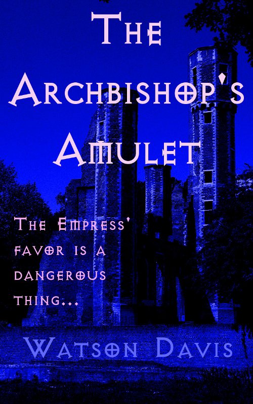
The first thing I’m going to need is the Title and the Genre of the book. I write mostly Science Fiction and Fantasy so I’m going to create a Fantasy cover. I’m going to have a random title of… The Archbishop’s Amulet.
Whew. Hard part’s done.
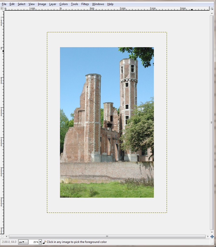
Now I need something to put on the book. I decide to use some photography so I need some royalty-free art. I go to dreamstime.com– they have royalty-free images–and I look through their free images and I find this one:
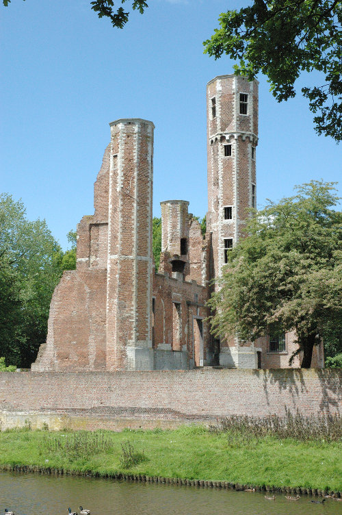
That will work for now. So I download that and put it into my work directory. I was really looking for a picture of an amulet. If I had wanted it bad enough (and if this was a real book I was working on), I’d spring for it and buy a picture of an amulet for the cover. Or I’d create the amulet myself but that’s for another blog post.
NOTE: Dreamstime only allows you 10 free images. If you’re hard up for cash and want to use a free image, then be careful that you get the one(s) you want. Another source for royalty-free images is 123RF.com but they don’t usually offer free images, at least, not that I know of.
Next I need some good fonts that scream Fantasy. I go to urbanfonts.com, click on Free Fonts, and I type in my title where it says “Type your text here”. This lets me see my title in the font. (FontSquirrel.com is another good source but they don’t have that cool text preview feature.)
I search through the fonts, looking at various types, until I find one I like. I’m looking for one that looks good for my genre (fantasy in this case) and that looks good and legible when it’s SMALL.
This last bit is very important. When your cover is displayed on Amazon, it’s frequently going to be shrunk down to about 100×160 pixels. If your font is thin, it’s going to disappear; if your font is over-stylized, it’s going to be unreadable. There are a lot of great looking fonts that are hard to read even when blown up to large size.
I poked around a bit looking at Scary, and Adventure, before deciding to look in Celtic. And there I found avQuest which I think will work. I downloaded that.
Now, I’m ready to begin.
I start up GIMP and select File->New. This is going to bring up the dialog below.
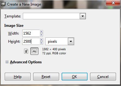
You want to create your new image as 1562 x 2500. Amazon has a max size of 2500 pixels high and there’s supposed to be a 1.6 ratio between the two numbers. So. There you go.
This creates a Background layer that’s white.
My next step is to select File->Open as Layers. That opens up a dialog that allows me to navigate through my directories to where I saved the image from Dreamstime. I select that file and GIMP loads it in.
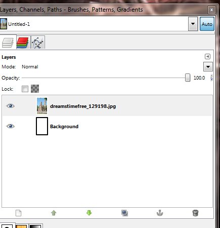
That shows up as a separate layer.
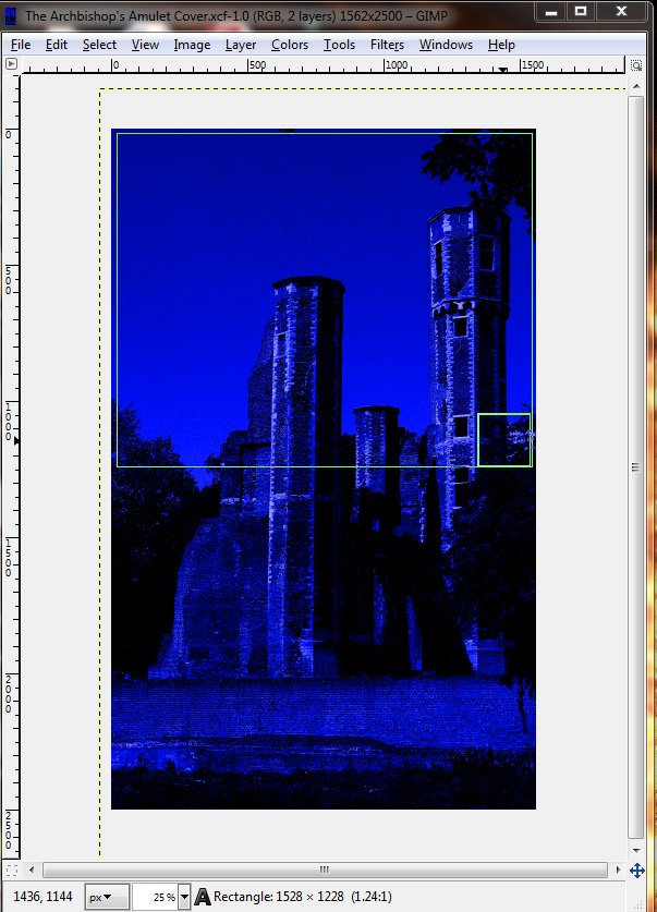
My downloaded picture is BIGGER than the picture I’m creating. Yours might not be. I have an option at this point of shrinking or expanding the picture to fit inside the window better by selecting Layer->Scale Layer.
You can also use the Move Tool to reposition the layer so you get exactly what you want where you want it.
I do that. I shift the picture around a bit until I find something that I think looks good. Your mileage may vary.
At this point, I save as “The Archbishop’s Amulet.xcf” in my work directory. I save it as an “xcf” file because that’s the base Gimp format that saves all the layers and whatnot. Later on, when I’m saving something I can use in Scrivener as my book cover, I’ll save as a jpg file.
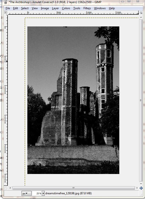
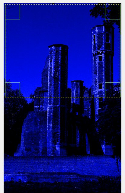
With my picture layer highlighted, I select Colors->Desaturate. A dialog pops up and asks a question, you can choose any of those methods and you’ll be fine; just say OK. This turns the picture into a black and white picture.
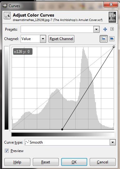
Next, I darken the picture up using Colors->Curves. This pops up a dialog box with a line at a 45 degree angle. You select the line at different points and move it around all sorts of ways and this will change your picture and do weird things to it. Play around with that if you want.
Here’s the dialog and what I ended up moving the points to.
And this is what my picture looks like now.
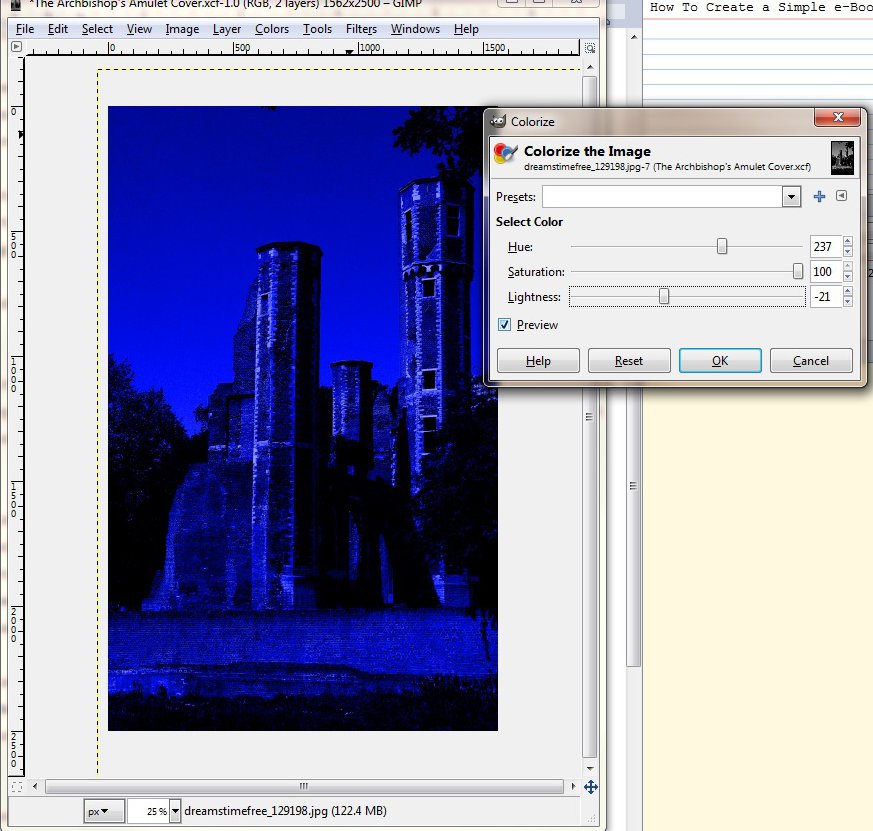
Then I color the picture using Colors->Colorize.
I chose a deep blue for this. (If this is not deep blue, just nod your head and act like it’s deep blue. I’m color vision deficient and there are some colors that don’t “look” exactly right for me.)
I save my work with File->Save. If you want to keep multiple versions, you can use File->Save As and add a version number.
Now I’m ready for some Fonts. So I unzip the font I got from Urban Fonts. This gives me a directory and in that directory there’s a file called Avquest that’s a True Type Font file (TTF). I copy that file to my .gimp-2.6/fonts directory.
I’m not sure exactly where that is on your particular machine. It depends on your machine type and operating system.
Good luck.
If worse comes to worst, you can just browse through the fonts you’ve already got and figure out the font copying thing later.
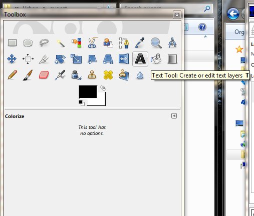
With that done, I select the Text Tool in the tool bar. That’s the button that looks like an ‘A’.
With that tool, I click into my picture and open up a selection box.
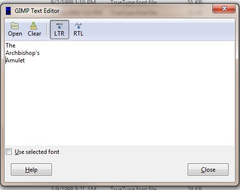
I will have a Text Editor box where I type my title (I’m going to type each word and then hit return so that each word is on its own line)…
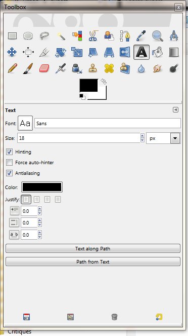
and a bunch of Text Settings in my tool box area.
Once I type that in, I get…
Basically, nothing.
This is because the font size is currently set to 18 and 18 is way too small. So I set the size to 300. Depending on your font and your title, you could have to set the size as high as 500 or as low as even 100.
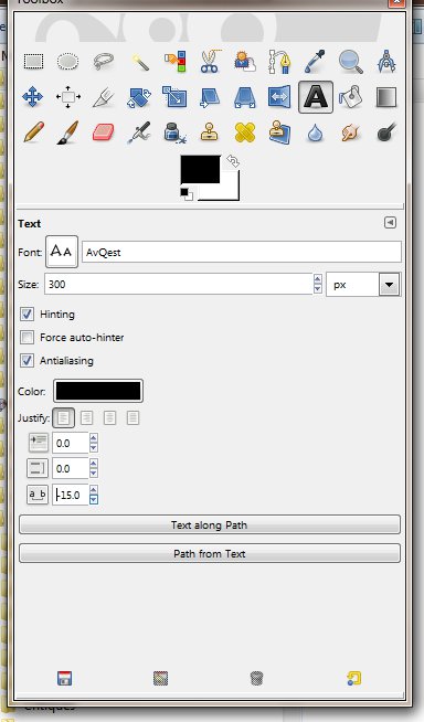
With the font set to 300, I like the size of the letters but the “’s” gets clipped off the edge. My text is a little too big. At this point, I could lower the size to 275 or 250, but instead of that, I’m going to reduce distance between the letters to make it fit.
If you look at the settings picture above, you’ll see that there’s a negative number typed into the bottom setting that shows a letter, some space, and then another letter. That’s where you change the spacing between letters. A negative number makes the letters get closer together.
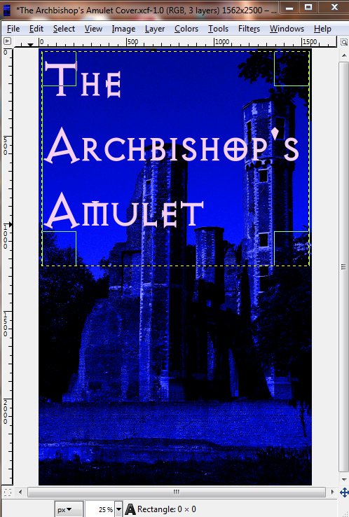
This looks a lot better. Except that I still can’t really read my title. And that’s kind of important.
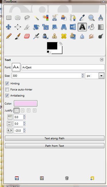
I have a couple of options here. The first option is to just change the color of the text.
Here are the settings for that:
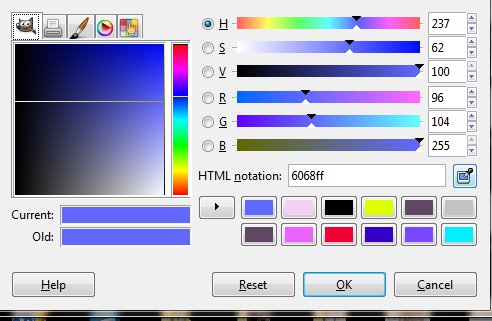
When you click on the color button for the text, it pops up this dialog:
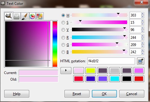
And that’s what I set my color to.
Frankly, I like this a lot. But I mentioned a second option, so I am duty-bound to show it to you.
I can keep the text black and create a background behind the text by using Filters->Light and Shadow->Drop Shadow.
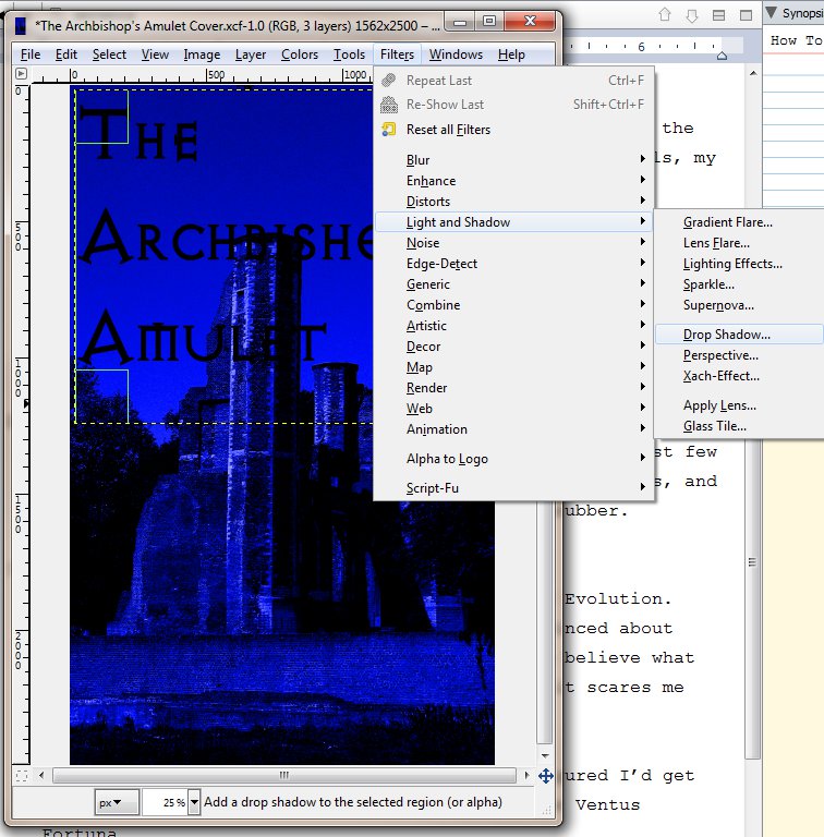
I chose the same light blue-ish white I’d used for the lettering above.

I think among professional designers, this is considered amateurish; so don’t tell anyone I told you to do this. But really, really don’t tell anyone that I actually like the way this looks in a lot of cases.
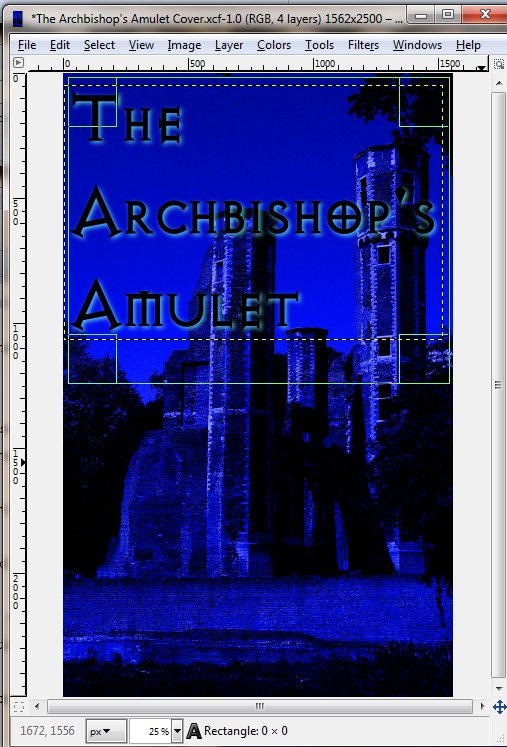
Just not this one.
At full size, this looks… OK. It doesn’t really pop.
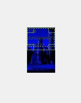
But the real test is when you Zoom Out.
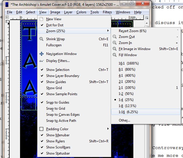
This 6.25% zoom is what you want to look at. I believe this is a little smaller than an Amazon thumbnail but you still want your title clearly visible and legible at this zoom. In this case, the title is totally obliterated.
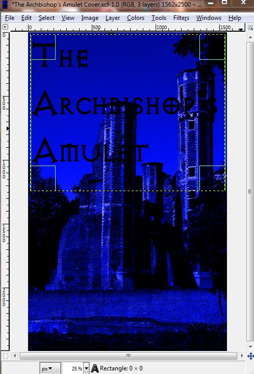
So I delete my drop shadow layer, re-set my zoom to 25%, and change that font color back to the light blue that’s almost white.
I go back through the same process for my name. I choose the text tool, select out a block where I want my name to appear, type my name into the Text Editor, fiddle around with the font size and the spacing between the characters until I get something I like.
But this time I decide to go with a different, darker shade than what I used for the title. And to get that shade, I use the Eye-Dropper tool to select a color from the picture (see below). I chose one of the darker bricks along the tower’s edge.
Then to finish it off, I add a lure which is some text that hints at what the reader is going to find inside the book. I took the title text color and darkened it slightly for this.
Now, when I reduce this to 6.25%, I get this. The title is legible, my name is a bit unreadable, and the lure is impossible to read… which is OK.
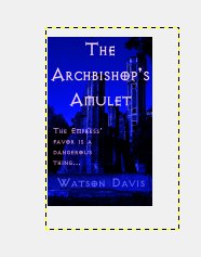
To me, that’s a decent cover. It’s not great. It’s not going to win any awards. But it didn’t cost $500+ and it only took me 30 minutes to slap together even with all the typing I was doing for the tutorial.
There are definitely things that could be improved.
I could make my name more readable but I’m not a big name writer. No one is going to be lured into buying this book because of my name. Not yet. So I’m not concerned with that. The lure text probably should not be legible at this zoom level. You want someone to click on the book to try to read that text. So that’s actually good exactly the way it is.
The biggest fault/problem with this cover is that it doesn’t really scream Dark High Fantasy. This could possibly be historical fiction or some other sort of fantasy. And that comes back to having a picture of a castle instead of a proper amulet like the one I see in my head with maybe some sparkly magic vortexes and some twirling skulls or something.
Anyway, I hope you found this helpful. I hope you learned some things.
Let me know what you think.